Piko
sport nutrition | creative direction
-
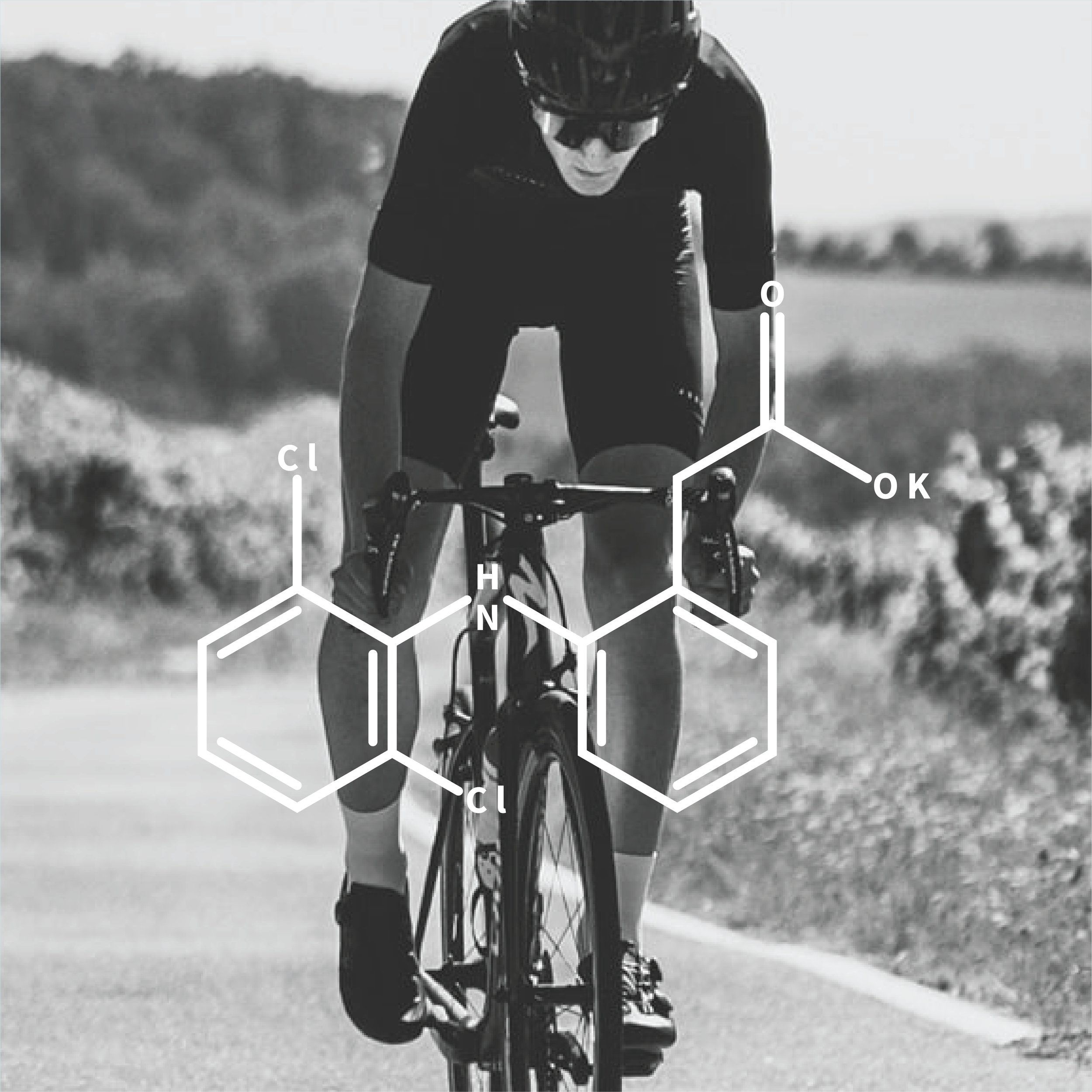
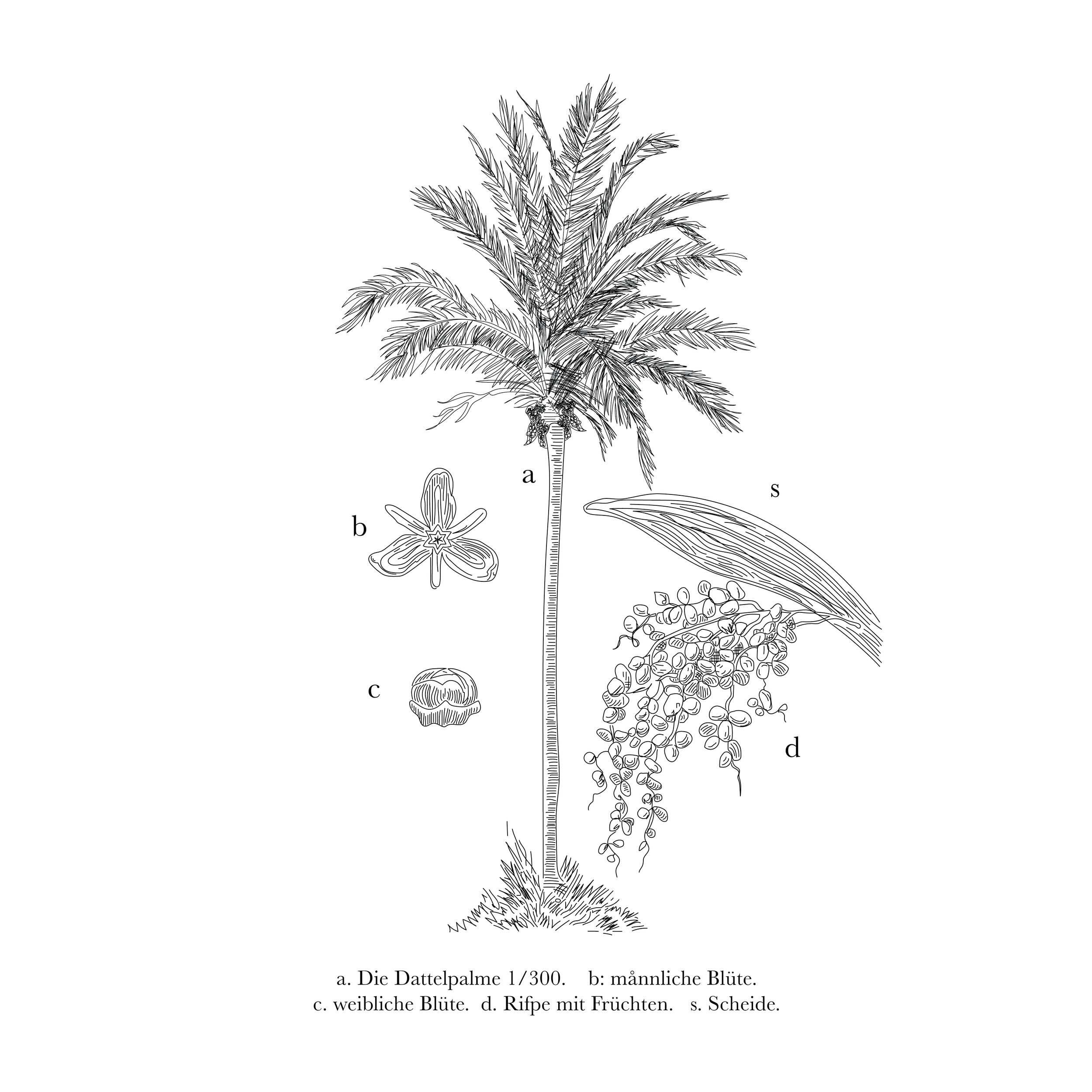
Endurance athletes need quality nutrition to perform at their best. Piko offers a healthier alternative, using dates as the main ingredient to fuel the body through long hours of activity. Naturally rich in carbohydrates and potassium, dates are gentle on the digestive system, minimizing glucose spikes while delivering the same performance benefits as artificial products.
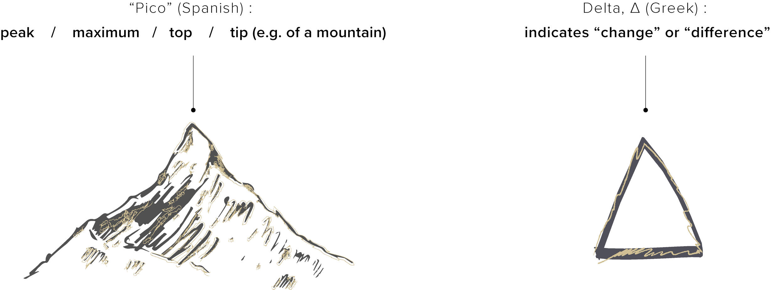
The core principles of the brand are to take athletes to their peak performance, and become the alternative to products with artificial ingredients.


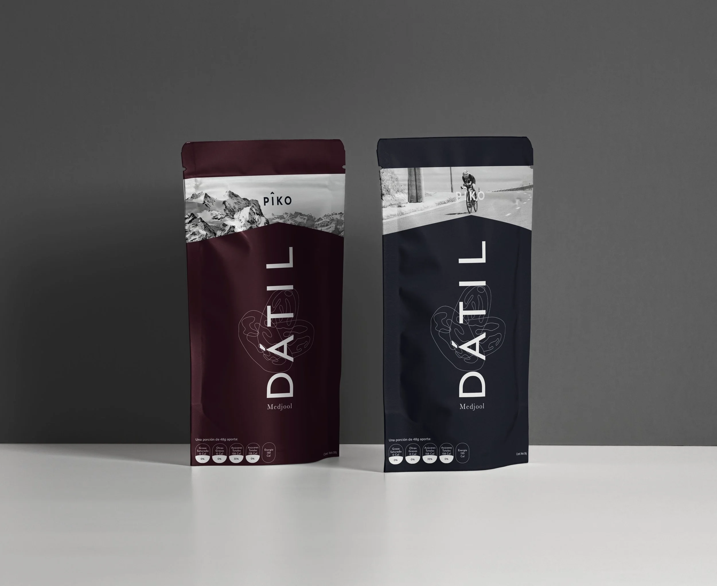
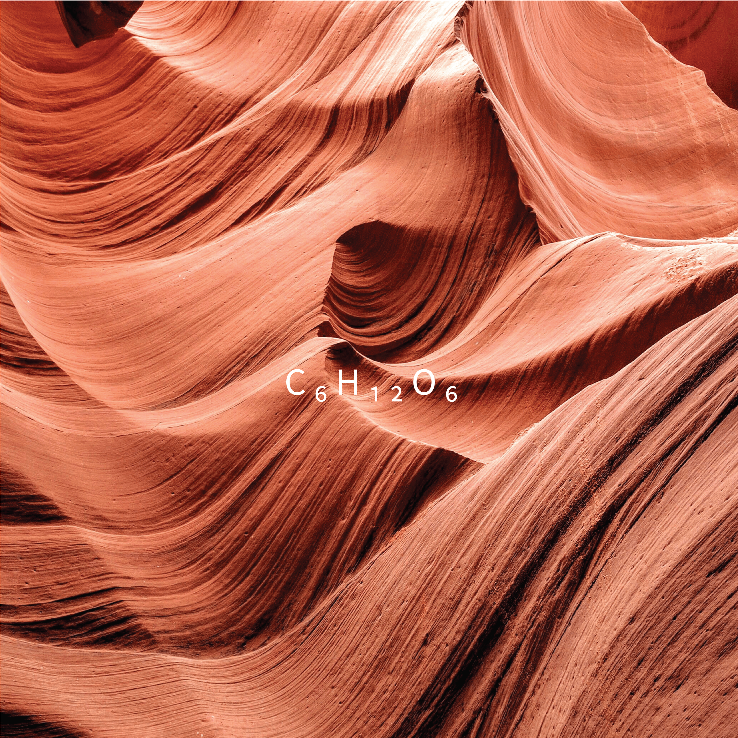
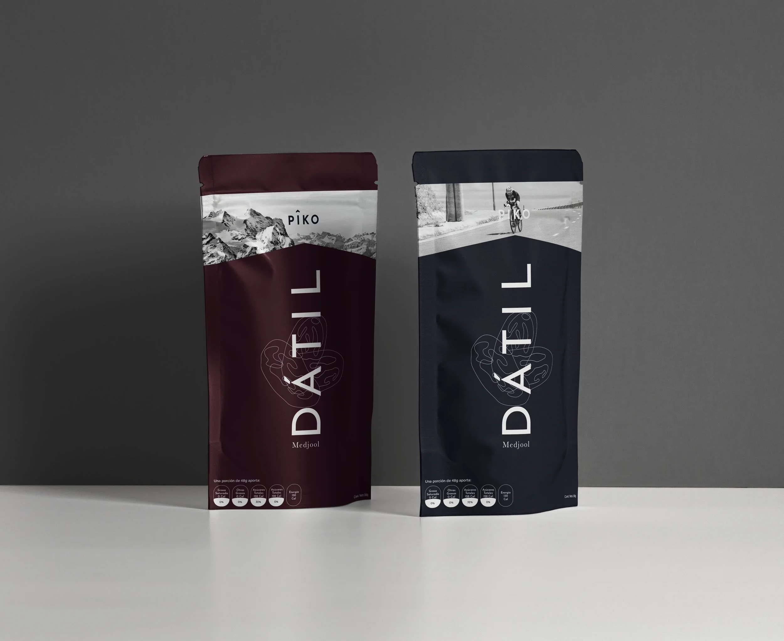
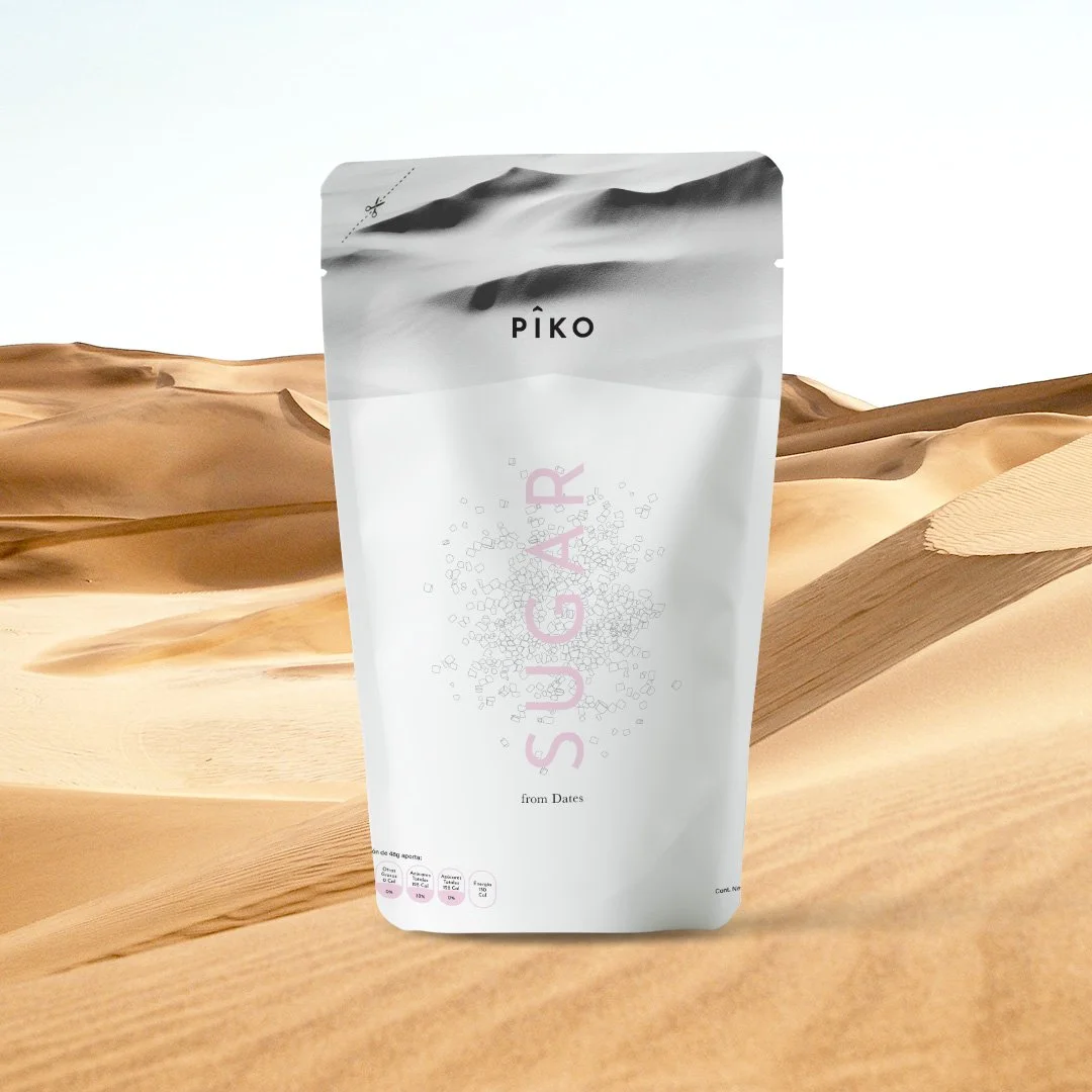
The color palette is inspired by earthy tones, as Piko is dedicated to using natural, unprocessed ingredients. Burgundy represents dates, and white can be used as an accent color when needed.

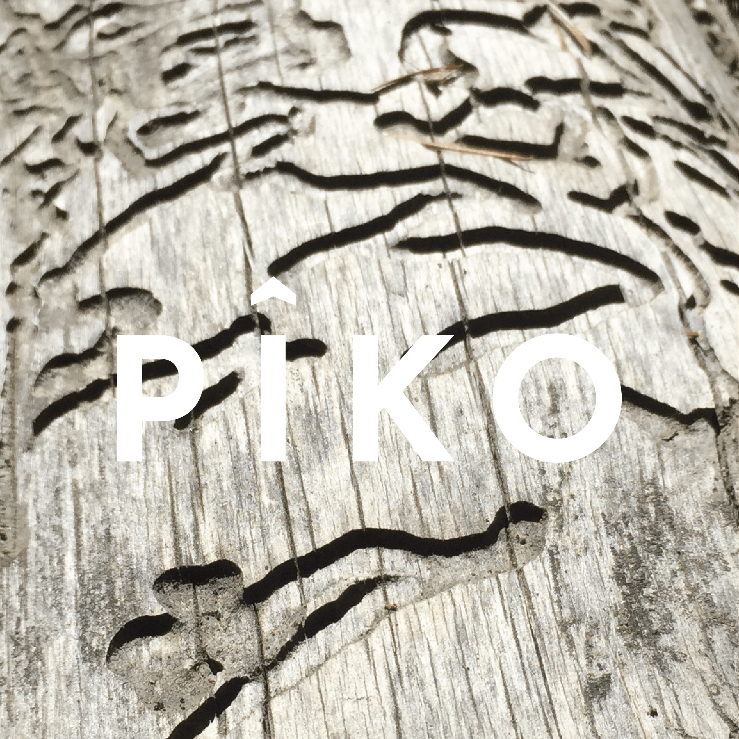
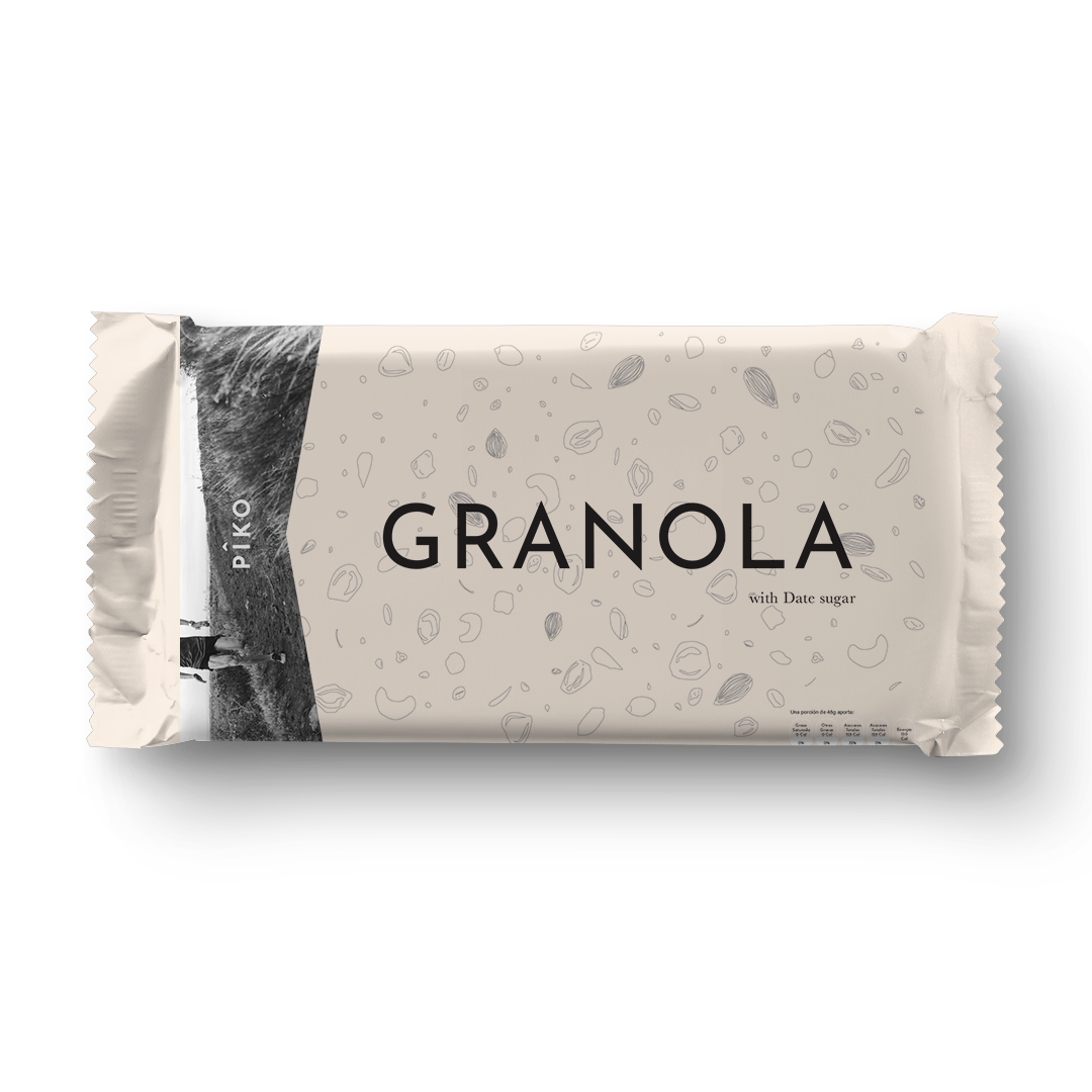
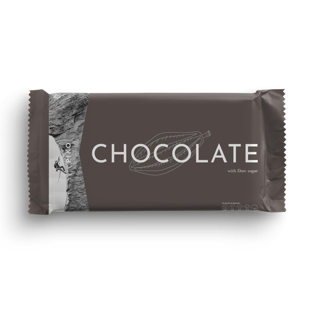
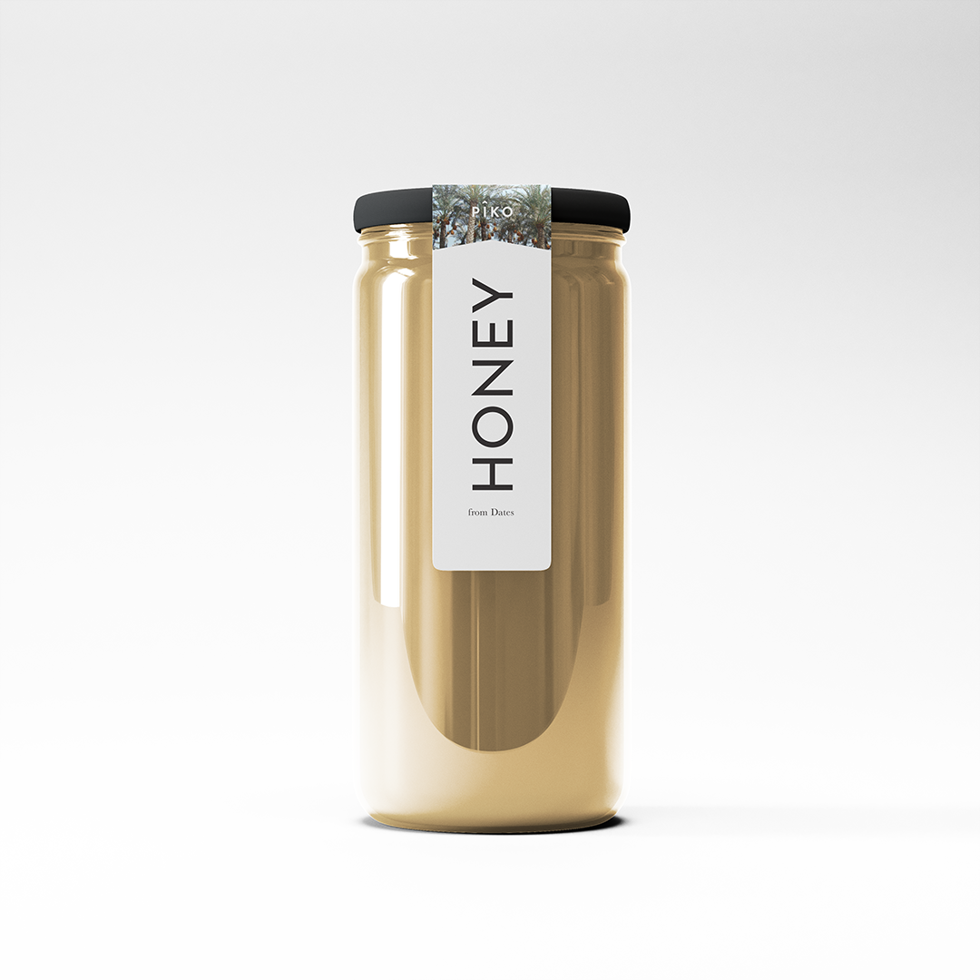
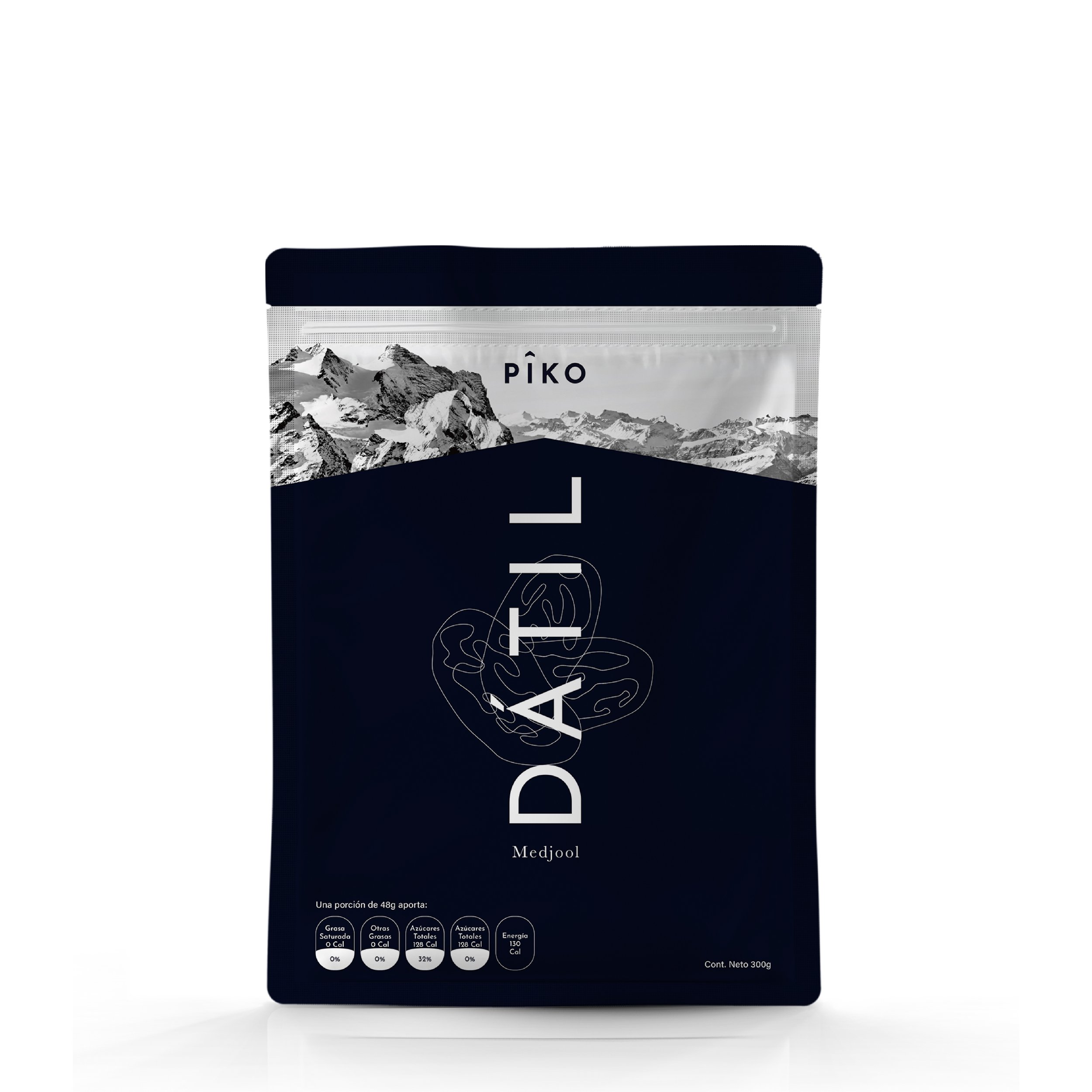
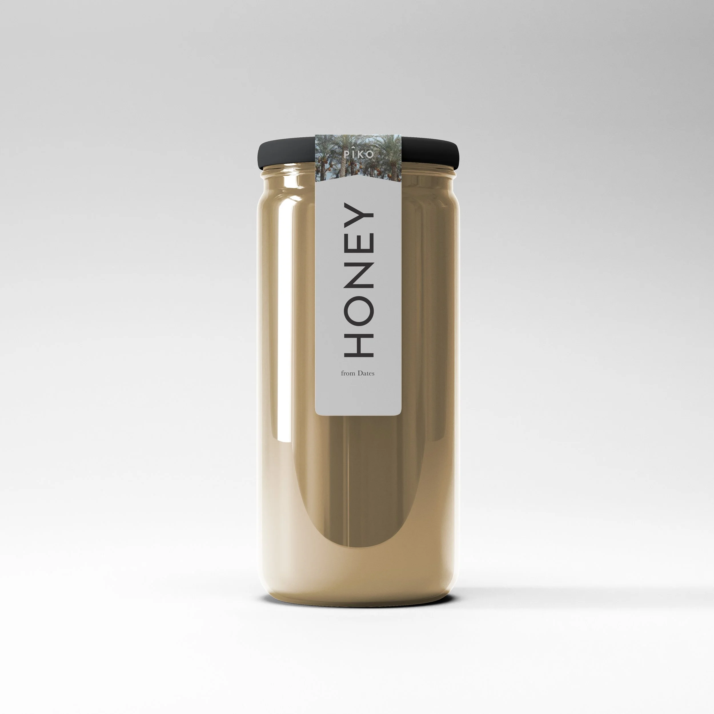
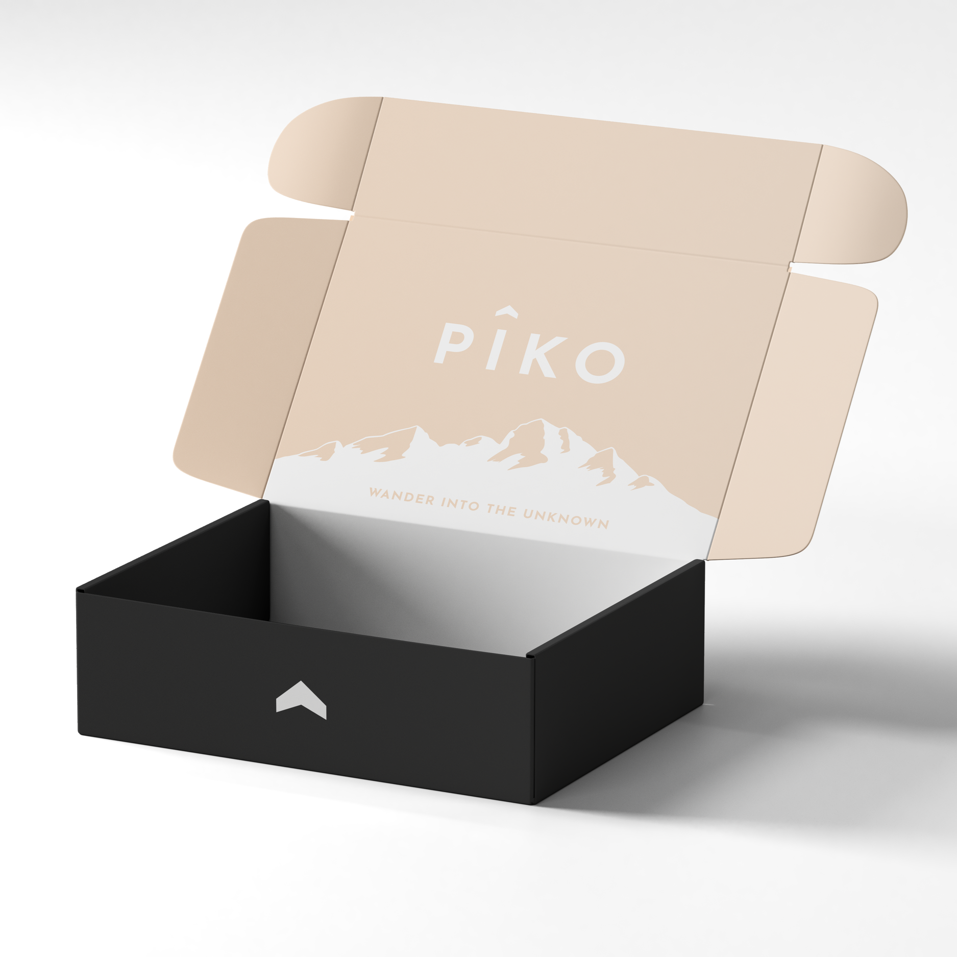
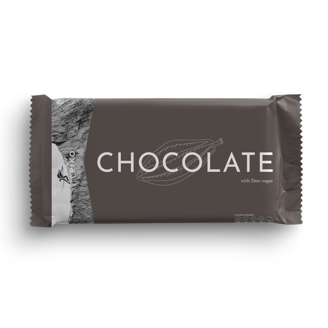
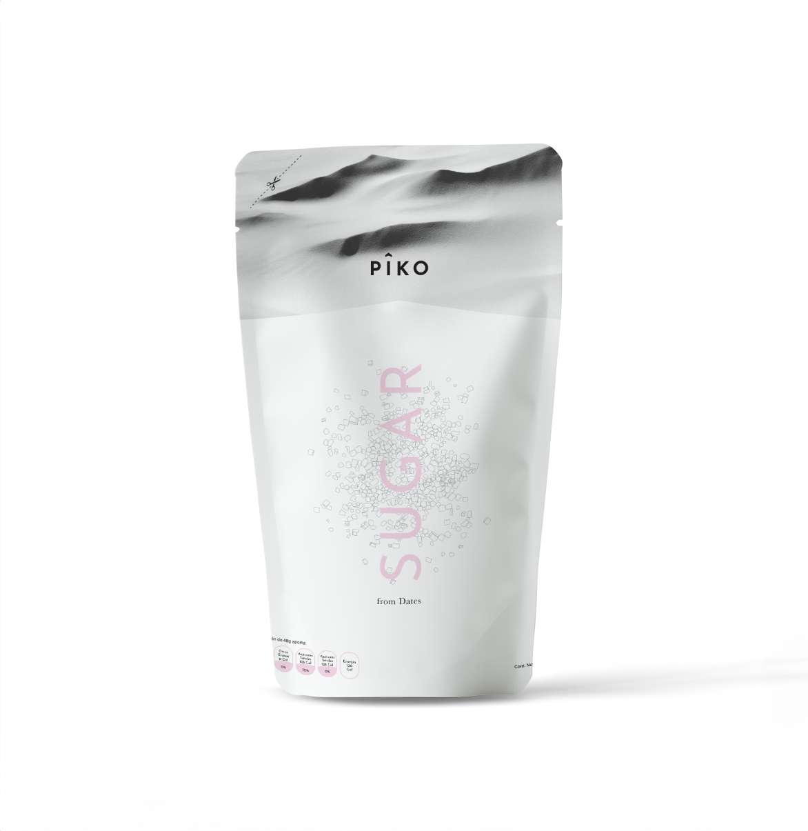
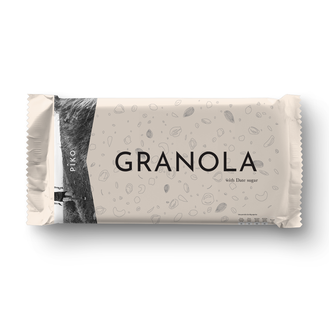
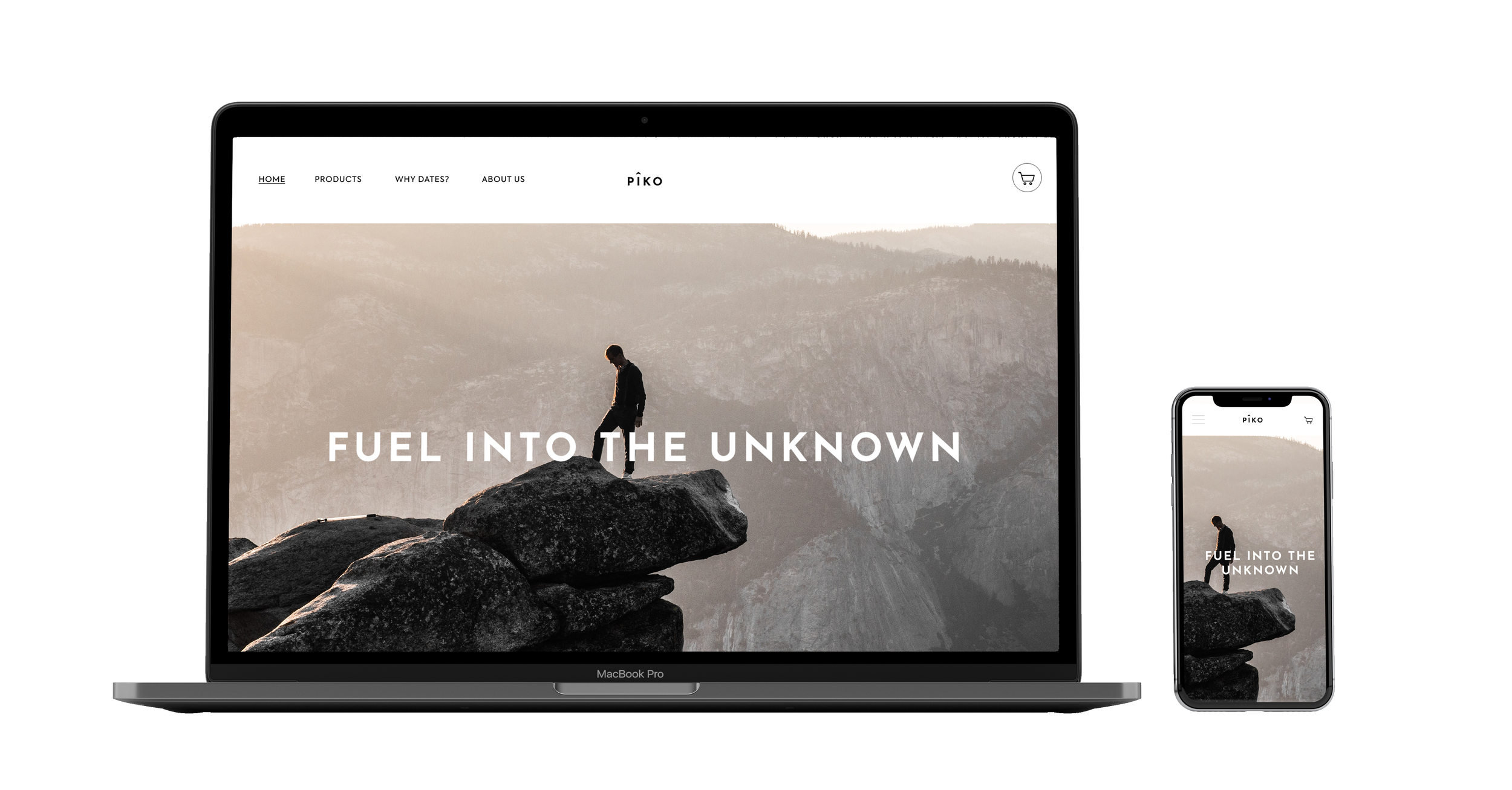
Piko’s packaging design draws inspiration from the wilderness and the rugged terrains athletes conquer during training and competition.


Social Media