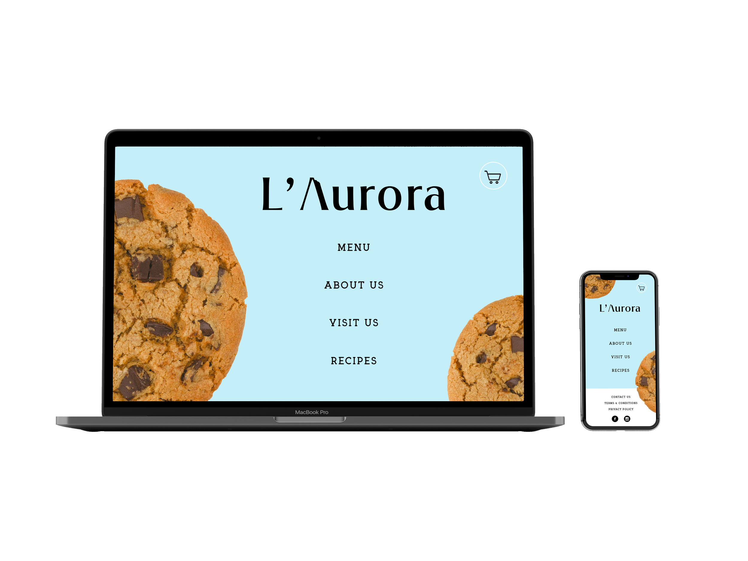
L ’ Aurora
2 0 2 1
food retail | visual identity
-
L’Aurora is a family-owned cookie shop founded in Mexico more than a decade ago. In 2020 the owners decided to reinvent their image to appeal to new and younger customers.In collaboration with Monjaraz Arquitectos and Paola Serrano, we created a new identity and space for the company to continue growing without letting go of its family history.
-
Monjaraz Arquitectos
Designer – Paola Serrano
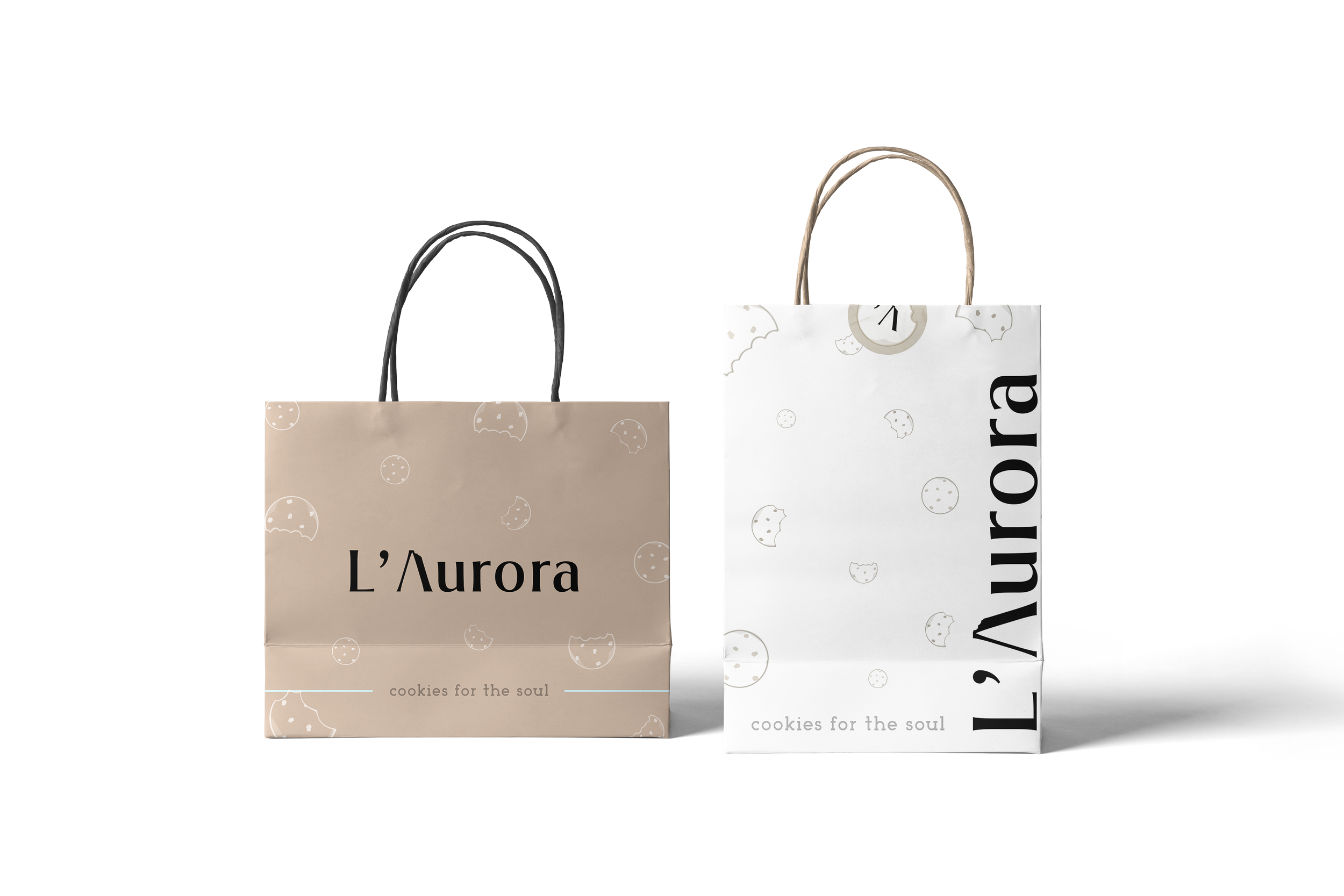
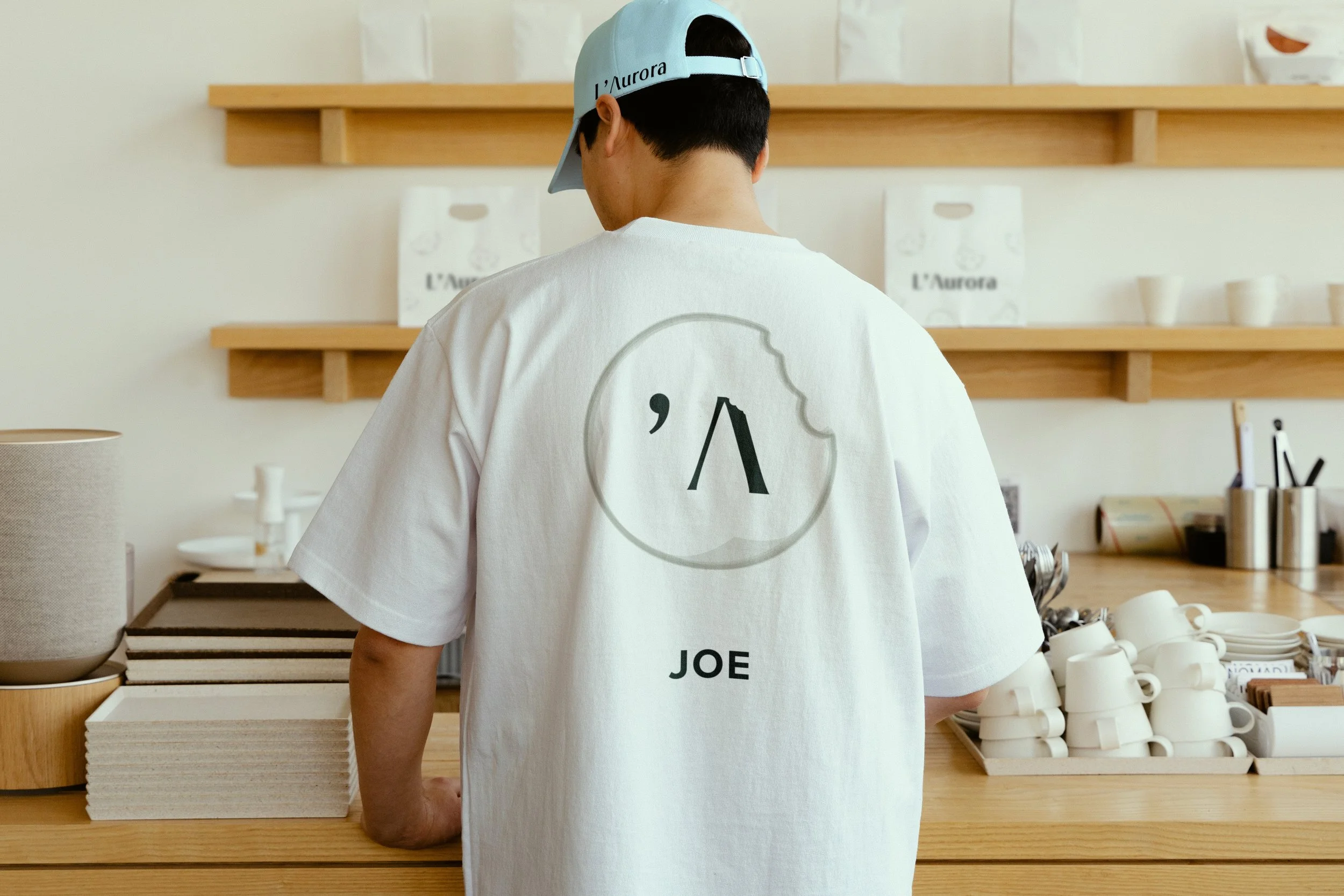
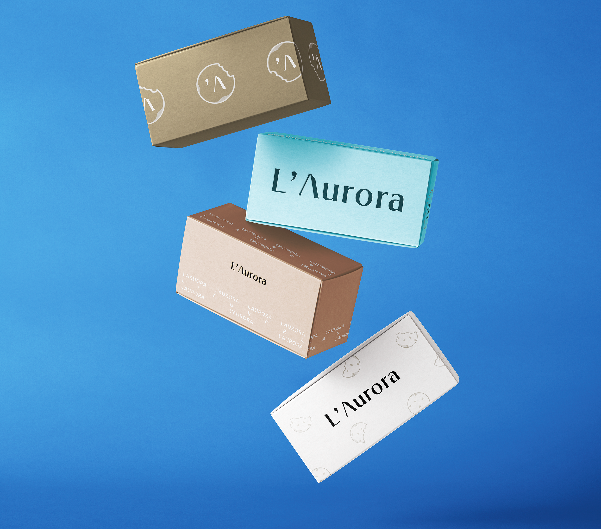
It was crucial for the family that their new branding represented their home state and their famous cookies.
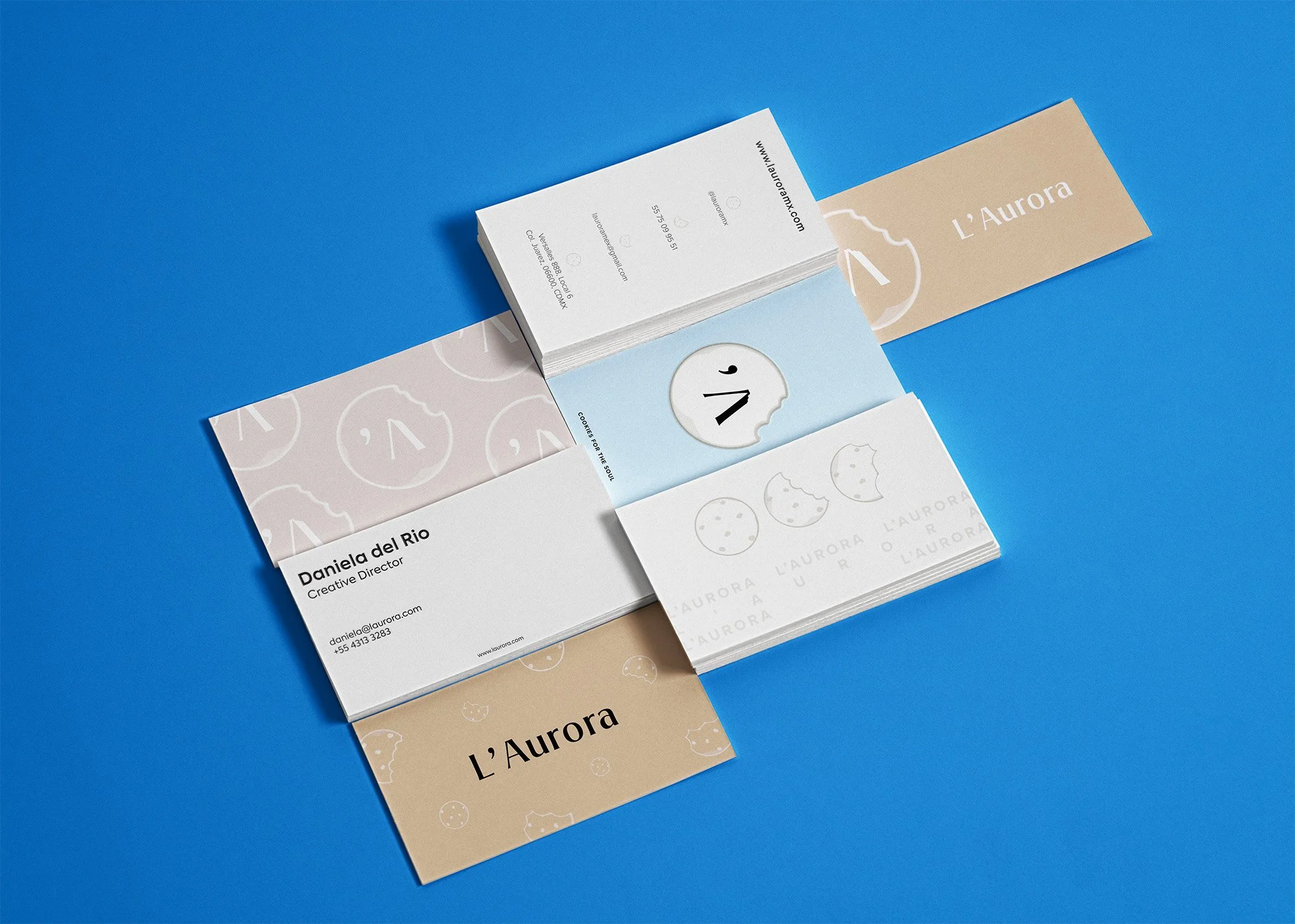
The new logo features a subtle image of a bitten cookie encompassing the A that represents Puebla’s famous active volcano, Popocatéptl.
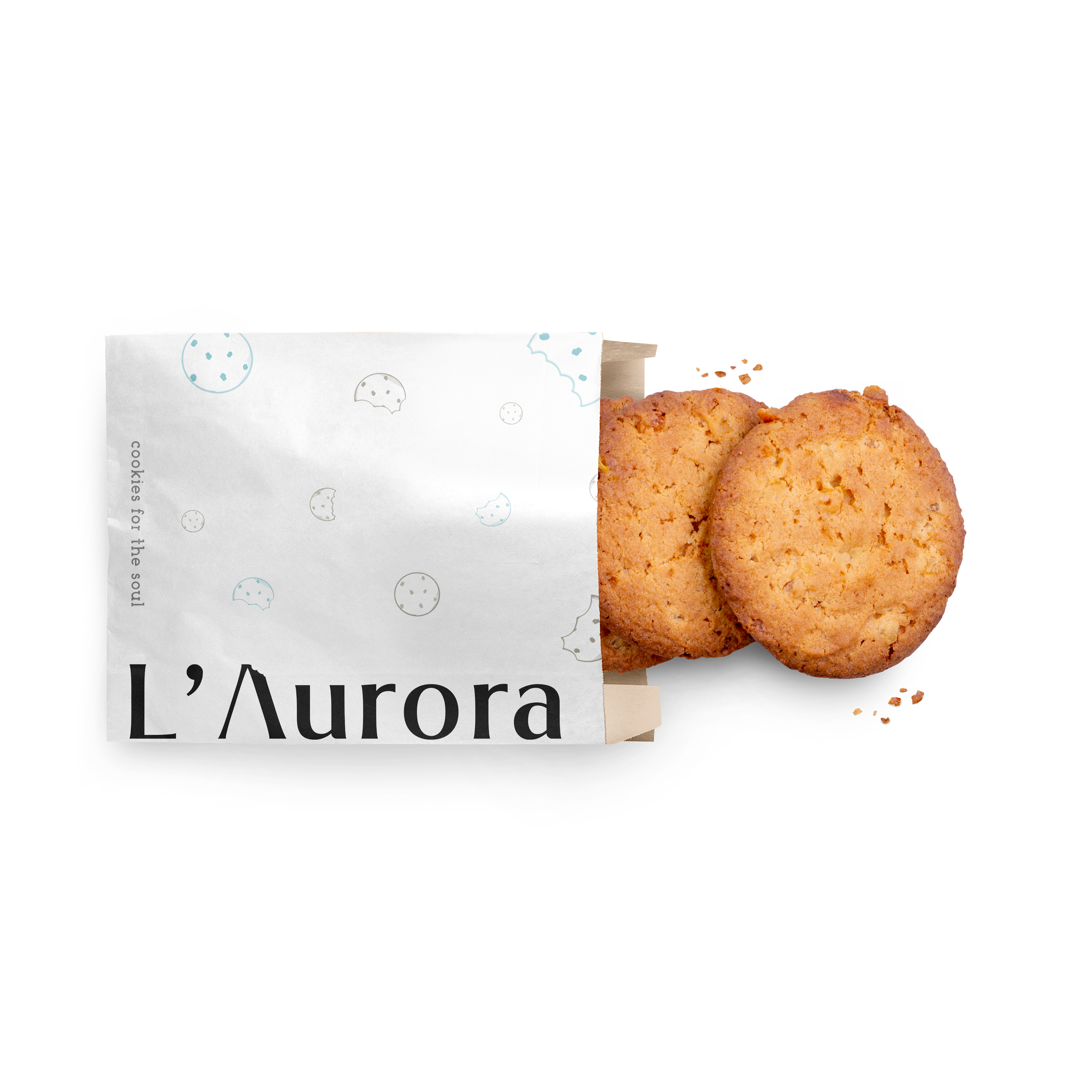
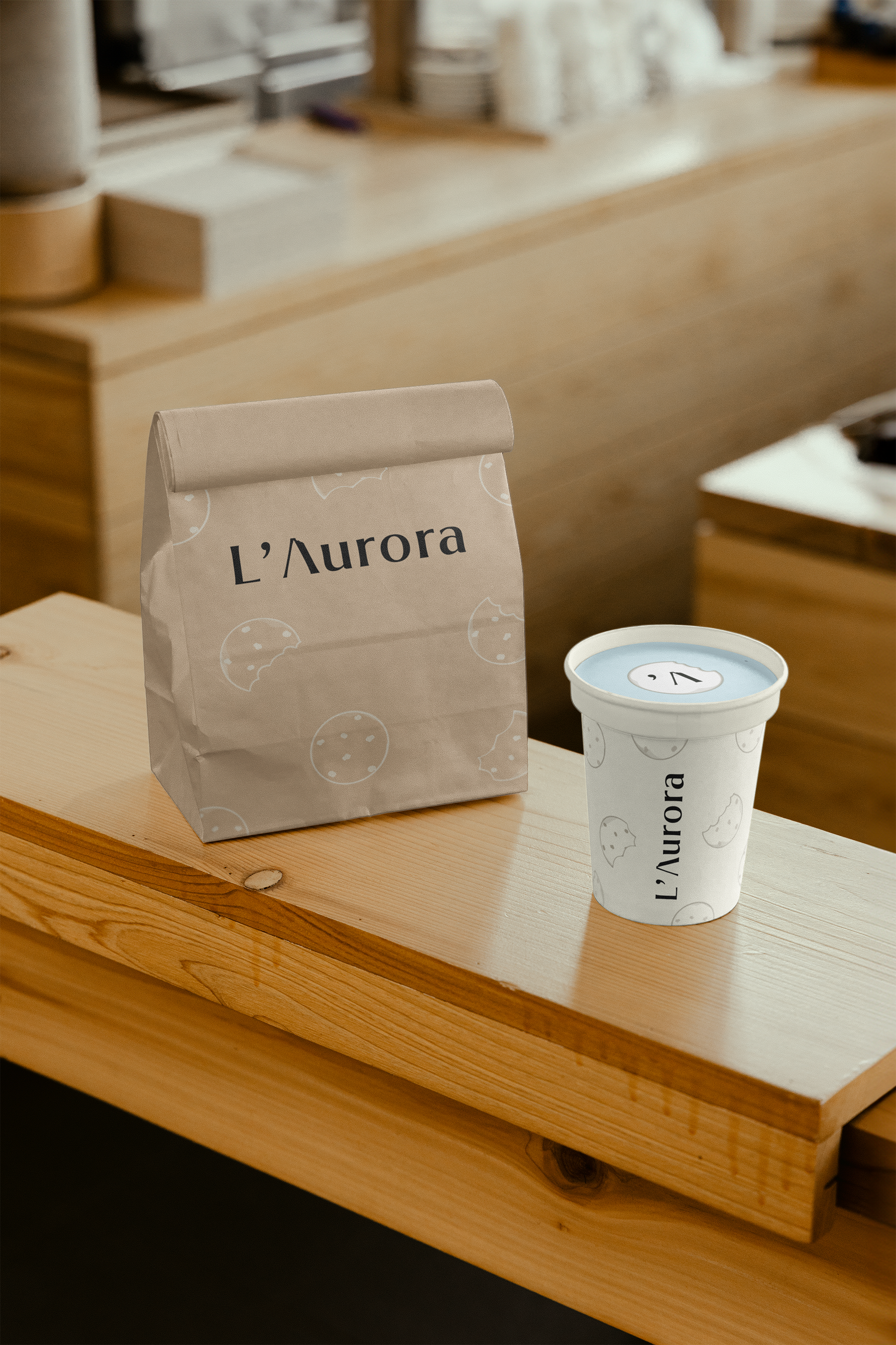
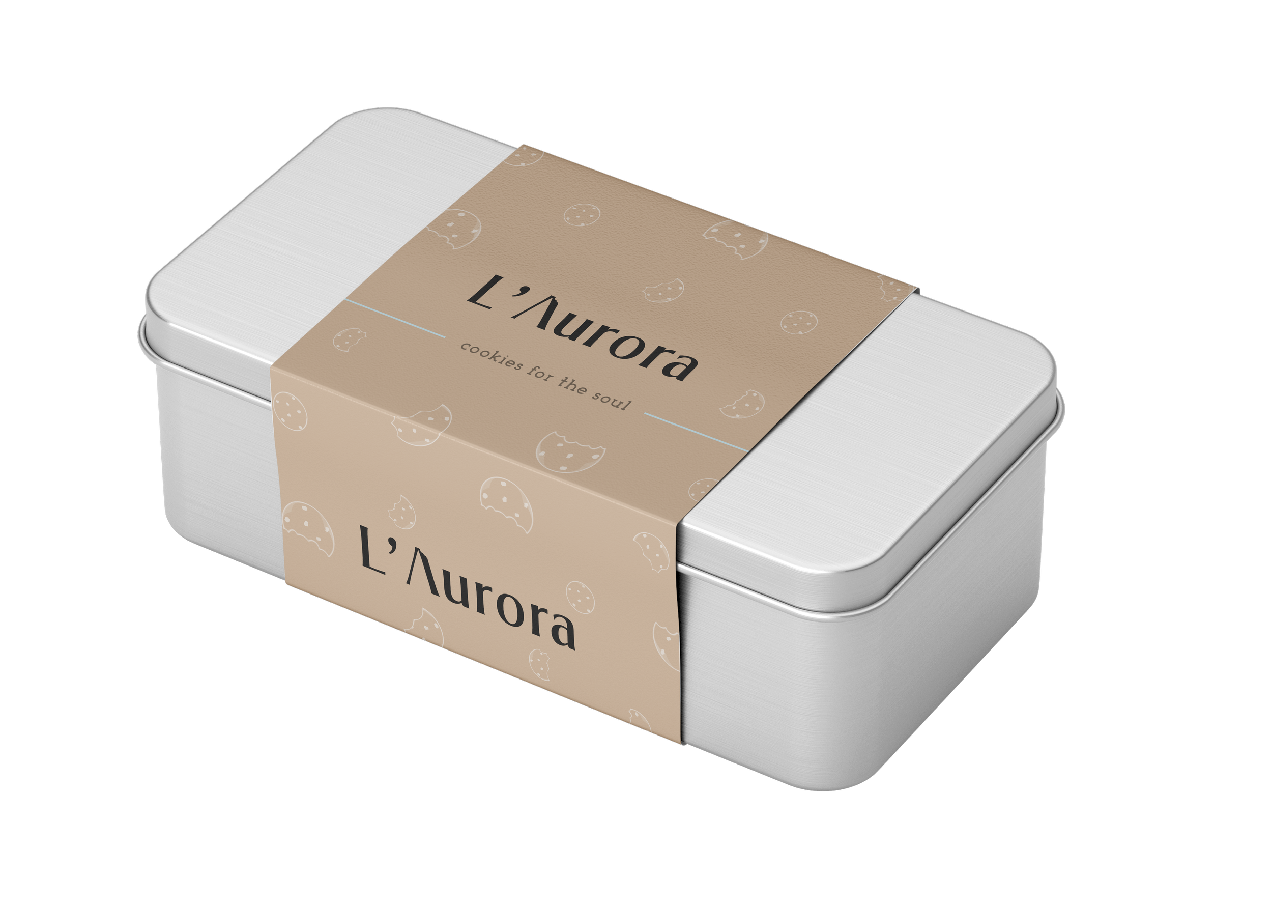
Earthy colors represent softness and comfort like cookies. Light blue bridges generations, from kids to older clients who have visited the shop since it was established. The overall goal is to show that quality and comfort have not changed regardless of how many years have passed.